Kurt Komoda     agony@optonline.net
Follow me on Instagram! https://www.instagram.com/kurt_komoda/

Thursday, October 3, 2024

Le Roi en Jaune: The Poster I Drew for the Play That Doesn't Exist That I'm Not Sure Was Ever Used


    Back in 2017, Dennis Detwiller, of Arc Dream Publishing, asked if I could do an Art Deco 1917-18 poster for the King in Yellow play. This was at the same time I was working on the King in Yellow Tarot Deck for them. I love working in different art styles. In fact, I love it a lot more than working in realism, but those jobs just don't seem to come my way. This blog post will just be a run through of the course this project took.

   ▼ Well, it starts with sketches and, right off the bat I wanted the character Demoiselle Jeanne d'Ys to be in the poster and, right off the bat I got her all wrong. 


King in Yellow Poster Sketches 01, by Kurt Komoda


King in Yellow Poster sketches 02, by Kurt Komoda

    ▲ So, Demoiselle d'Ys is supposed to be a Breton woman living in 1573. She is described as such:  "Her lovely head with its dark curly hair was crowned with a headdress which set all doubts as to the epoch of my own costume at rest. Her slender figure was exquisitely set off in the homespun hunting-gown edged with silver, and on her gauntlet-covered wrist she bore one of her petted hawks."

▼ Well, I had no idea what a Breton woman in 1573 looked like, and I still don't know what a Breton hunting gown might look like. Tradtional Breton costume does indeed have silver designs and edging, though:

Traditional Breton Costume

    So, I was a bit lost as far as the Demoiselle d'Ys concept was concerned, so I began looking more towards a design that featured a woman in lamentation- hence, the tomb sculpture studies you can see in the sketches. I was pretty sure I wanted the pale mask of the King in Yellow to be like one of those Greek theatrical masks.

d'Ys, by Kurt Komoda
An attempt at drawing Demoiselle d'Ys.


  ▼ I eventually repurposed the lamenting woman in the second page of sketches and my concepts for Demoiselle Jeanne d'Ys in the Lovecraftian cookbook, Necronomnomnom:


"Gin and Miskatonic" from The Necronomnomnom

The Cake in Yellow, from The Necronomnomnom


   ▲ Yeah, I figured any inaccuracies in the depiction of d'Ys could be forgiven, since she's just this little side drawing on one of the pages.

   ▼ On to concept number two, where I've ditched d'Ys and gone with the lamenting woman, based mostly off of this tomb sculpture from the St. Joseph Cemetery in Cincinnati, OH.

Tomb sculpture from the Stn Joseph Cemetery, Cincinnati, OH

     ▼ This version isn't Art Deco at all. It's more reminiscent of Symbolist artwork, which I adore.

King in Yellow poster sketch, by Kurt Komoda


King in Yellow poster concept by Kurt Komoda


   ▲ So, that didn't go anywhere. I like the image well enough, but it wasn't a fit for what the client was looking for.

   ▼ Next was a concept sketch where, looking at it now, I'm not sure what I was going for. I use my sketchbooks as journals, and I can usually look at a page or drawing and remember where I was and what I was doing and thinking. This sketch, though. I must have just been doodling. Just throwing stuff at the wall to see what lands in nice chunky clumps. Also on the page, we see another tomb sculpture study, some floral border work- probably from Walter Crane, and a study of pokeberries.

King in Yellow sketches 03, by Kurt Komoda


   ▼ Okay, now here I had landed on what would eventually be the final drawing, still with an undeveloped Yellow Sign.


   ▼ Just a bit of Louise Brooks, and the sketch is ready to send to Dennis.


   ▲ With this sketch approved, I start with a base digital drawing. ▼ By this time, I had settled on a design for the Yellow Sign, which you see at the bottom....in black. 


It created my own version of the Yellow Sign to be used in Arc Dream's King in Yellow Tarot, because I didn't want to re-use Kevin Ross' version of the Yellow Sign:


Kevin Ross' Yellow Sign

 ▲  The Ross version is, I think, owned by Chaosium, but I also wanted to try and create my own. The only mention of any sort of description in Robert W. Chambers' The King in Yellow is: "I opened the box. On the pink cotton inside lay a clasp of black onyx, on which was inlaid a curious symbol or letter in gold. It was neither Arabic nor Chinese, nor, as I found afterwards, did it belong to any human script." So, to me, it has to have a Westerner's passing notion of an Arabic or Asian character, and it also can't be simply described with shapes- otherwise the narrator would have just said as much. I also wanted to come up with a design that was easily drawn, since it would appear over and over.

Kurt Komoda's version of The Yellow Sign
Kurt Komoda's Yellow Sign


   ▲ Well, I may not have nailed it, but I've been using it ever since, in just about every project I've worked on.

   Anyway, back to the poster. The ink version got approved, I think- I can't seem to find the original emails between me and Dennis. It mayyyy have just been he liked the pencil and said go with it, and I just sent him my finals. I don't recall any tweaks or changes. What I did though, however, is just create a whole bunch of variations ▼:


   ▲ So, the one that was selected was bottom row, right (and also as the main image of this blog post). That was back in August of 2017. The Delta Green: The Conspiracy Kickstarter, which included the release of the King in Yellow Tarot, didn't complete (is that the correct term?) until July of 2024. Pretty sure the poster isn't in any of the books included with that, so I'm not sure what happened to this at all. It may not have been used. That happens some times. Oh well, you have seen it here. Bye!

EDIT 2024OCT04 1527 EST: I was told that the poster appears in Arc Dream's Delta Green: Impossible Landscapes!


Wednesday, July 27, 2022

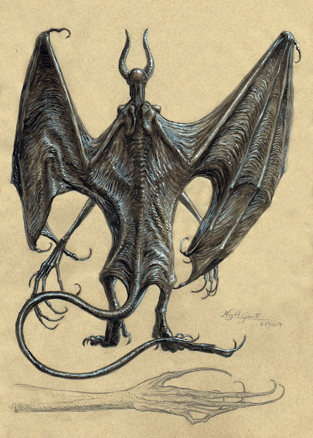
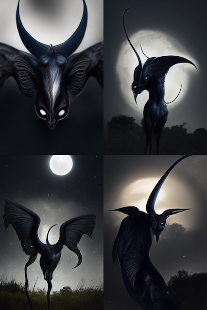
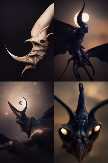
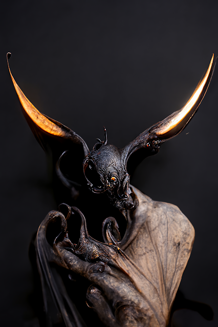
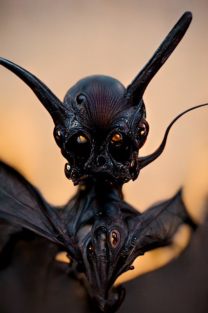
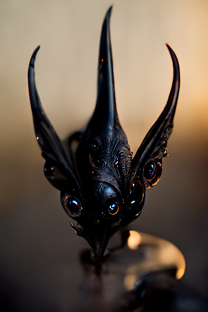
Night-gaunt: a Midjourney Midnight's....Journey


  Salutations! A word I learned from Charlotte. Midjourney. That thing that every artist friend of yours is posting instead of their own work, and I see that it's got some people uptight - threatening to block anyone who posts Midjourney results, and such. I kind of get it, but I really do see this as an exploratory tool. It's like being able to talk to your tv and have it create a show for you....except that you have to type in a strange prompting language and it only creates still images. Believe me, an a.i. multimedia creation platform is on the way. Just think of the porn- and I know you did. 

  So, I'm pretty familiar with H.P. Lovecraft's night-gaunt, so when I was able to access the Midjourney Beta, it's one of the first things I tried to have it create. And tried. Annnnd tried. You shall now bear witness to my toils- and they weren't ever really toils,  as I enjoyed every result for one reason or another. So, let's jump in.

 Sweet, but not the tickling-terrors of Lovecraft's nightmares, Too fuzzy, too bulky.


 Okay, so that's odd. It gave me what looks like giant water bugs. 


For some reason, adding a stormy sky background added just enough confusion for the app that it got rid of the bat wings and leathery texture.


  Okay, really weird. These are looking more avian or moth-like. Some possibilities with the first one, but not enough to spawn variations from.

 These four are only interesting to the extent that the top two almost look like creatures from Wayne D. Barlowe's Expedition, sans bioluminescence

Okay, now we're getting somewhere. Not night-gaunts, but the upper right is the most night-gauntish of them all, so I figured I'd upscale render that one. 

I love the texture.
  
Trying to make a curved horn with the prompts, for some reason curved the sun, making it look eclipsed.

This one did a really nice job with the leathery skin and the wrapped wing membrane. NANG- Not A Night-Gaunt, though.


Failed Guyver.


Some sort of fish or a mask or a fish mask.


Don't know what this is, but I like it!


See, here we're getting close! It has some sort of barbed spike hand.


This looks like something dead and leathery you'd find on the beach. Some sort of discarded imp corpse.


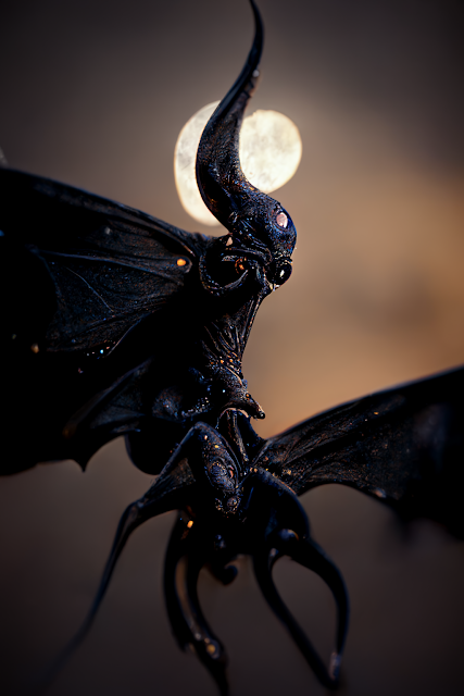
This is my favorite of the lot. Not a night-gaunt, but just a great, nasty demon of some sort. If nothing else, it's great texture and color reference.


I like how its clutching this white orb that may in fact just be its head.


This one has wings like an elder thing!


  So, we never got a true night-gaunt. Actually, never really thought we would, so I was very pleased with the fever dream versions we got. I even like the small gallery of Dreamworld butterflies we ended up with. Maybe as I learn the prompts better, I can get closer. We got pretty close tonight, and apps like this are only going to get better. I'm not out of a job yet, though.


Monday, July 25, 2022

Of Ghouls and Graveyards, Lovecraft in Providence


  Pickman's Model, a July 28,1934 drawing of a ghoul by Lovecraft, himself. There are two ghoul drawings done by Lovecraft that I know of. The first is dated one month earlier, June 21, 1934 (below). Both feature a ghoul in a graveyard with a Boxer-like underbite and a small tail. Interestingly, neither of these features are mentioned in Lovecraft's descriptions of a ghoul. The ghoul in the earlier drawing features some sort of skin texture, which could be a lumps or fur- possibly both.


  Now, I've already covered my interpretation of the Lovecraftian ghoul in a previous blog post, Ghastly Ghouly : H.P. Lovecraft's Ghouls and Ghasts, so this post is more about a fun detail in the second drawing: the tombstone. Unfortunately, I cannot find a higher-res version of this drawing online, but I believe it comes from a publication of Lovecraft's letters, so I may have to track that down. The tombstone in the lower right features a winged cherub head and an inscription.


  Now, it's a bit hard to make out, but it reads: SACRED TO THE MEMORY OF. Now, this inscription is hardly unique and neither is the winged cherub head nor even the shouldered shape of the tombstone. All three together IS, however, notable, and I hope to explain why.

H.P. Lovecraft in St. John's Cemetery.

  Here is a photo of ol'Howard Phillips himself, photographed on a stroll through the St. John's Cemetery at the Cathedral of St. John, in Providence, Rhode Island- not far from where he lived at the time. It's a small cemetery, with the path cutting in from Benefit Street (behind Lovecraft in the photo) and going down a slope towards North Main Street and the cathedral.

A view of the cemetery, looking westward, toward North Main Street.

  Okay, now bear with me. See where Lovecraft is standing? Well, of course you do, but let me further illustrate my point by doing something I haven't done in a long, long time: create a moving gif! Behold!


  Pretty neat, eh? EH? Okay, so it doesn't really tell you much except that I was there, trying to match up my shot with a different type of lens and it only kinda sorta worked. So, if we start from where he was standing and pull back a bit, we see a set of tombstones on the left, which Lovecraft would have been able to see on his walks through the cemetery.


  Well, okay, he would have seen them on his walk back up the hill towards Benefit Street. What we're interested here is the tombstone on the right: the grave of one Mrs. Deborah Checkley Paget, born 1718, died 15 April 1793, but as far as I know, that's not important. 


  What is important are the inscription and engraving at the top. Can't make it out? ENHANCE!


  That's right, folks. Y'all saw where this was going. It's the tombstone from the drawing....at least that's my theory. We've looked around, and there was no other combination of a shouldered marker, winged cherub, and Sacred to the Memory of inscription in the cemetery. The cemetery in the drawings includes lawn crypts and what looks like a distant mausoleum, so it certainly isn't supposed to be the St. John's Cemetery, but that's okay. What does this all mean? Ehhhhh probably not much except that Lovecraft would have seen this grave on his walks and maybe he just remembered it for his drawing. STILL, I find it kind of neat.


********

  While I've got you here in the cemetery, I may as well show you something else, so sit yerself right back down and grab a nice cold Clamato and some year-old Toffifay I bought in bulk. 

The One-Winged Angel


  So I illustrated a Lovecraftian drink recipe book, Lovecraft Cocktails- available in fine book stores everywhere! - and on one of the pages I decided I decorate it all pretty with the image of our dear Mrs. Paget's tombstone. Now, close by the Paget grave was a small eroded statuette of an angel and an urn for flowers. From the photos I took in July of 2019, I thought she only had one wing (upper right), so I thought, "Oh, that's neat. I shall depict my recently departed friend, Leslie, as this one-winged angel. Aren't I clever?" Well, a return trip to the spot in 2021 revealed that the angel did, in fact, have two wings, they were just angled off to one side, for some reason (lower right).


  Why are the wings cocked to one side like that, though? Maybe there was more to the grave that is now gone. I still like the image of the one-winged angel well enough, even if it was erroneously inspired.