Kurt Komoda     agony@optonline.net
Follow me on Instagram! https://www.instagram.com/kurt_komoda/

Wednesday, October 20, 2010

I'm on Covered!

Yay! My cover for Beanworld 8 got put up on "Covered!"

Kurt Komoda covers Tales of Beanworld 8

Tales of Beanworld No. 8 rendition by Kurt Komoda

Original Tales of Beanworld No. 8


 I definitely need to participate in more art activites like this.

Saturday, September 4, 2010

  A long time ago, there was something called "MySpace." It might still be there, but my account has long since been deleted after realizing that Facebook was a much better way of keeping in touch with friends around the globe. One of the only things that kept me interested in MySpace was the whole "Top 8" concept- you know, those 8 friends that you selected that were better than all others(called the "Less Than 8" or <8). Every once in a while, I would come up with ways to customize my Top 8(called, at least on my page, The Mega Super 8 Strike Team) in artistic ways. It was a neat way to give myself something to do- which is something I need to do all the time, before I'm nothing but a commercial artist doing other people's work. My favorite Mega Super 8 Strike Team(MS8ST) project was when I decided I would draw each one in the style of one of my favorite comic book artists with each illustration done in the style of the artist's comic.

  Right off the bat, I had trouble picking the 8 artists. I knew I wanted Moebius and Hergé, for sure. I had a bunch of other artists floating around in my mind, but then the trick was to match the style with the person, and what they'd be doing on the fake comic book cover. Some people's faces were a better natural match for the artist in question. First off was Judy, because I thought she'd look good as a Hergé character:


  I grew up reading the full-sized Tintin comics and I knew I wanted to match the style as close as I could. I think I got the fonts spot on. I drew the background from a photo of a square in Prague, I think- but, I drew it without thinking about the cover as a whole. I did a bit of work on the clock tower, thinking it was such a nice composition before realizing that it would all be hidden behind the title scroll.


  Though it looked right at the time, I think the black line work is a bit softer than the ink line that Hergé used.

  Next up was my friend, Daniel, done in the style of Katsuhiro Otomo and his original Japanese printings of Akira. Now, the thing is, Otomo's covers for the Akira books always used his painted illustrations, but that's not the style of Otomo that I wanted to try, so I cheated a bit:


  I knew I really wanted to experiment with his incredible depictions of vehicles and mechanical devices, as well as his master use of zipatone. If there's one thing I hate drawing, and those who work with me know this: it's wheeled things. Especially bicycles or motorcycles. And when I say "hate," I'm only saying that because I can't do it well at all. It's the wheels- all those perfect ellipses- the fine work on the frame, and the relation of the rider to the bike itself. To me, it's very challenging, even when I have exact reference, so I knew that this would be fun. Daniel is a sales manager at Soho Vespa, in NYC, and he's an avid rider of both scooters and motorcycles, so I matching him with Otomo was a no-brainer.

  To complete the drawing, I created a whole folder of fake zipatone(which I called zipaClone), with a wide variety of tones and gradients. I applied them pretty much the way real zipatone is applied, but did it digitally: I cut out a selection of zipaClone and placed it over the area, applied a hide-all mask, and then just brushed it in with the paintbrush tool. I think it worked out pretty well.

  Anthony was next, and he's a lover of the old Peanuts strip and cartoons, so I didn't have to think very hard to come up with this one. He also has this round face and a high forehead, so he translates well into the style of Charles M. Schultz.


  Even before I started looking up reference, I knew there would be a problem: Peanuts was never really a comic book with a regular format and a recognizable cover style, so I had to cheat again. There was a series of Peanuts books that had this exact format. Well, almost exact- I couldn't find the font they used, so I had to modify an existing one. Originally, I was going to have all the characters on the cover be original- either mine or my brother, Paul's- so that Snoopy would have been some character of ours, or maybe another person I know. It just wouldn't have worked. It HAS to be Snoopy to really sell it.

  I absolutely had to try and do one in homage to the master, Winsor McCay and his Little Nemo in Slumberland strip. My friend, Sarah, has a face that works well with McCay's clean style.


  Now, be warned, the linked image is a HUGE file, but I wanted to, well, show off the work I did to replicate the style of color printing from the old strips. I laid in each color separately and then applied a Half-Tone filter in Photoshop, but then purposely offset the orange-red color up and to the right by several pixels to simulate an often inconsistent printing process. Again, I ran into the same problem I had with the Peanuts project: Little Nemo didn't come in comic book form. The style I chose was from a McCay collection book that had a nice cover layout. This project also gave me the chance to put a number of other friends in supporting roles. 

  I was going to do my friend, Jerry, in the style of Moebius(Jean Giraud), but eventually went with Geof Darrow and his Hard Boiled comic.


  I figured, from the start, that there would be a car crash. Or a plane crash. Or a huge locomotive crash. Some sort of crash. Something sure as hell would have to be crashing into something else, and there would be a lot of flying glass pebbles and crinkled metal and human bodies all crushed up in there. The guns I drew are actually a lot more streamlined and based on real models than what Darrow probably would have drawn. I remember having a real problem trying to come up with an appropriately pulpy line of dialogue for Jerry to say as he lept between to colliding vehicles. One was "This is a school zone: the school of PAIN!" I'm not crazy about the line I chose, but it functions for what it is, I suppose. I think I should have made the vehicles bigger, or Jerry smaller.

  Frank Miller was not an artist I had originally thought would be in my top comic book artists list, but then I was looking through a Miller comic my friend had and was reminded of just how clever he was with the play of white and black.


  I showed no such mastery in my rendition. I think I made a lot of choices that Frank Miller would never have made. The whole process of creating this one was kind of painful- a lot in part, I think, due to the fact that I was relatively new to Miller's style. I kept considering changing to another, more familiar style, but Paul had seen the sketches I had done and was excited to see the finished "Sin City" result. Paul has this huge, Judge Death-like grimace, and I knew I really wanted to play that up in the Miller drawing- maybe just showing the huge teeth and eyes over an immense shadow, but I just couldn't get it to look right.

  The Robyn "Jamie Hewlett/Tank Girl" cover was the last one I did, because she was pretty late in coming to my Top 8. I was going to use my friend Ken, who is Japanese and has this great Hewlett-like mop of hair with a bang that covers one eye, but I went with Robyn, instead. I was hoping to use Ken in a rendition of  Shigeru Mizuki's "Graveyard Kitaro," but that never got done.


  Robyn doesn't really have a face suitable for Hewlett's style, but I knew I wanted to do a Hewlett cover. My friend, Sabrina, would have been perfect for this. She doesn't look like Tank Girl, but she does look like she could be a Hewlett character. I'm not crazy about the fact that I so closely followed an existing cover, with the super-deformed tank and all, but I am relatively satisfied with the end result.

  So, that's as far as I got, and I never got to do a Moebius cover. Because My Top 8 had one or two slots that kept changing, I had 3 more covers planned- I may still do them. Someday.

Wednesday, May 26, 2010

TESSELATIONS, by Kurt Komoda- Taken From an Agony a Go-Go Article Which Was Taken From My Former MySpace Blog


   Tessellations. It's what M.C. Escher referred to as "Regular Division of the Plane." Basically, it is filling a surface with the same exact shape or shapes. At it's simplest, a checkerboard is a tessellation. The earliest of complex tessellations can be found in the Alhambra. Unfortunately, the Moors, who built the palace, were forbidden to depict living things in their works of art. Today, tessellation is mostly relegated to mathematicians and crystallographers. Escher took it further than anyone before or after. His creative mind, eye and hand were like no other, and I have always been in awe of his work.

Alhambra tiles
  In 1995, a man named Kevin D. Lee, of Sandpiper Software, created a program called "Tesselmania" that allowed even children or people who like Wolfsheim to create their own tessellations. As the story goes, Tesselmania was a product of "The Learning Company" and was later bought by a toy company and effectively buried forever. I have never been able to find a fully functional copy, although I have it for both Mac and PC. It's an extremely limited program. It runs in 256 color mode, has only one undo level, and draws like the earliest paint programs(no blending or mixing). The tessellations, themselves, can only be comprised of straight lines between a limited number of points. The PC demo version lacks a save function- so you'd have to take screen grabs and paste them into Photoshop or something. The Mac demo version only stays on for 30 minutes at a time. I've provided links for both versions below.

   Nevertheless, it is an extremely useful program. I wish someone would update it. It would be perfect for Illustrator. I've seen other programs, including an Illustrator plug-in, but none are as useful as Tesselmania. In the division of the plane, there are 3 main principles at work: glide reflection, translation, and axles(or rotation). A system of labelling the 28 known types of asymmetric tiling- using combinations of the 3 principles- was created by German mathematician, Heinrich Heesch, and is known as the Heesch Type. Tesselmania allows you to create using 15 of the 28 types. I won't drown you in the details of the types. Below are some of my efforts. You'll immediately notice the aforementioned primitive graphic style of the images.I would say that Tesselmania is only a starting point for identifying one's tiles. Further work could be done in another program to create a finished product, but I have so far found such an effort unnecessary. When creating these tiles, I have tried to adhere to the 3 rules laid out by M.C. Escher, concerning the shape of the tiles:
  1. Tiles must have a closed form. That is, the entire object must be represented. A tile cannot be part of something that trails off, but is not shown.
  2. The outline of the object must be as recognizable as possible. Simply making some wobbly shape and cramming the image of, say, a dog all rolled up into it doesn't count. I've seen this rule broken again and again. Another way of breaking this rule is the most common travesty performed by aspiring tessellators: the filling of empty space within the tile, or the creation of space-filling tiles around your tile- the purpose of which is to make the tiles "work." If we were to allow this, then any shape could be fit inside a tile of any shape or be surrounded with additional tiles until they make a combined shape that tessellates. I have done this in the image below. You see, I created this tile, but it didn't really work; I still had that little square space where the bottoms of the wings meet. So, I just left it there. Very lazy. Years ago, I patted myself on the back for this little creation. Today, I am disgusted by it.  
  3. Conjoined twins tile (a travesty).

  4. Finally, the outline must have no indentations and bulges that are too shallow or too deep. This is simply for the matter of distinguishing one tile from an adjacent tile. Long, spindly spikes, for example, and their complementary crevaces(for there must be equal-sized indentations for the tiles to fit together) become confusing to the eye.
   
   Anyway, here are my experiments. The colors in some are just horrible, so just try to ignore that, for now.

Buzzard Things. Was never crazy about this one. The line work of the feathers is extremely wobbly.

Girl in a Gi. People seem to like this one. I think it has a pleasant look to it.


Goth Chicks. Did this one on the Mac, and my 30 minute time limit was about to run out.


Lizard Guys. When drawing the borders for your tiles in Tesselmania, you can only use straight lines, and this is very apparent here.

Curly-Tailed Lizards. I like the effect of one tile spiraling into the others, but it can be more visually confusing than appealing.


Two Birds. The two birds are actually one shape divided into two forms. This is one of the last tessellations that I did, and I really think that a lot can be done using this method of dividing an already tessellated shape into any number of other forms that fit into it. I hate the colors that I chose.

Corgi Puppy.

Little Nik. This is supposed to be one of my dogs- or I should say "former dogs"- Nikita, as a puppy.

Ninja w/Kama and Head. I was just playing with shapes, and that's what it looked like to me.

Red and White Rabbits. I think this one is my favorite.


     You guys should download the program and try it out for yourself. In Windows, you have to right click on it, and in properties, set it to open in 256-color mode. For the Mac download, I don't think you have to do anything but put the appropriate tesselmania folder on your desktop, or wherever. You might have to do something so it opens in OS9(Classic). Remember, though- you only have 30 minutes at a time with the Mac version, and no save function on both. Take screen shots(command+4, on the Mac...PrntScrn on the PC).


Have fun, and be sure and share your creations!

-  Kurt Komoda


Tuesday, April 27, 2010

The Penanggalan


Yellow penanggalan on red background, by Kurt Komoda

   Hello! I just posted some of my Penanggalan drawings over at Eaten By Ducks, but I was concerned with keeping it brief and not hogging up the page. Here, however, I can do whatever I want. So, let's begin.


a penanggalan lifts an infant from an altar with her intestines, by Kurt Komoda.
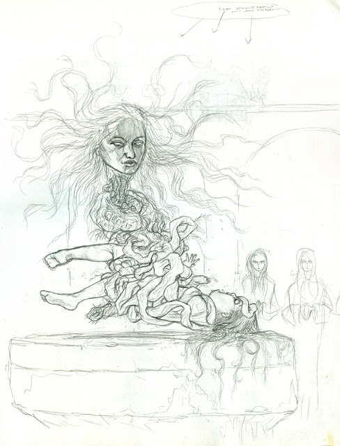
A penanggalan lifts an infant from an altar with her intestines.

penanggalan eating a baby, by Kurt Komoda
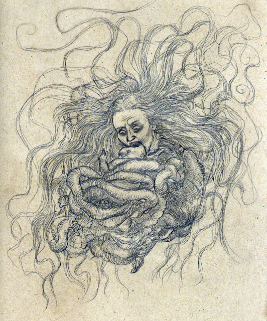
Penanggalan devouring a baby.

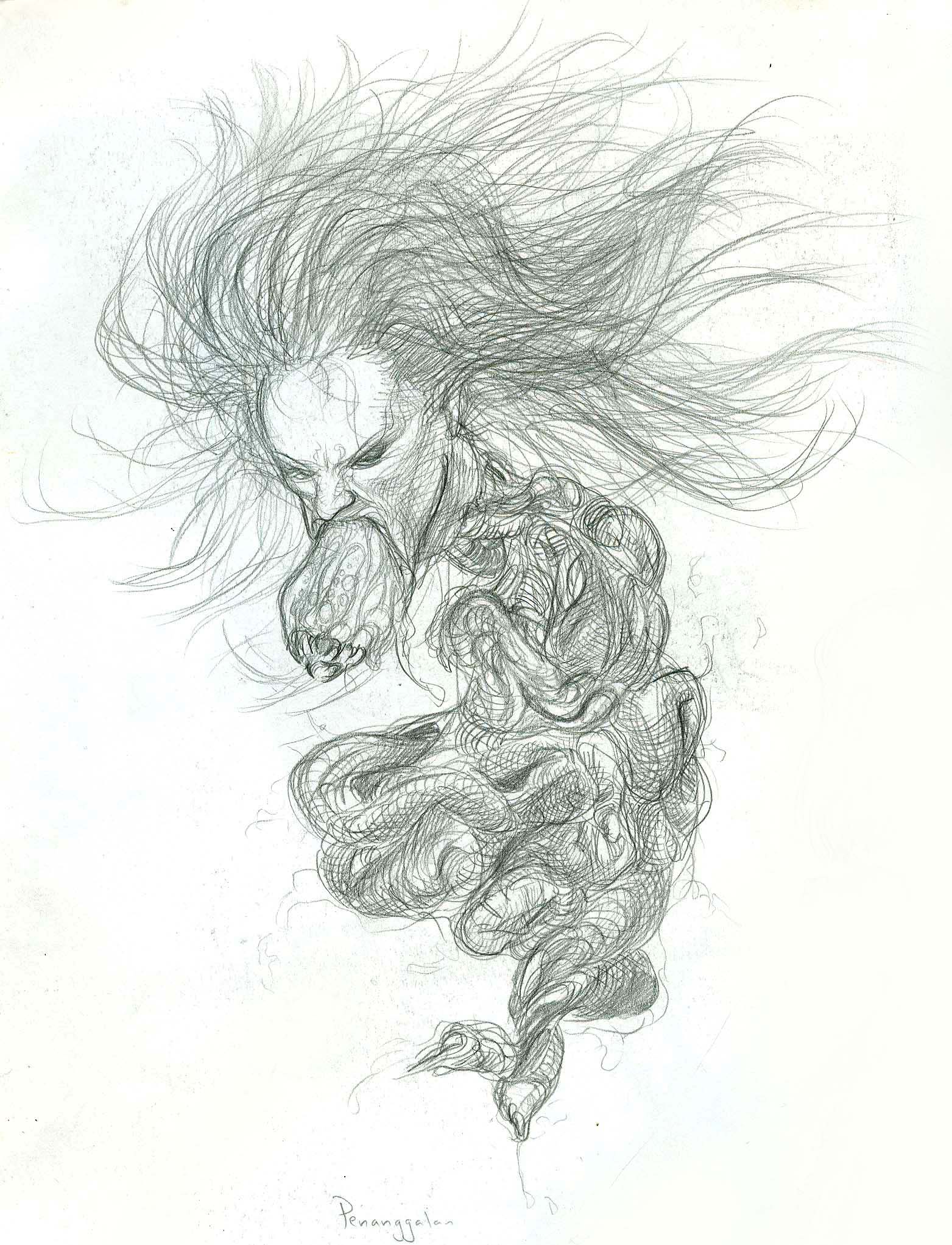
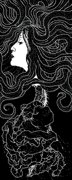
 My fascination with the Penanggalan began back in the 80's, when I first saw her mentioned in The Fiend Folio, an Advanced Dungeons & Dragons monster compendium. Essentially, the Penanggalan is a female vampire from Malaysian folklore, consisting only of her floating head and a complete set of organs dangling from her torn neck.  Though no folklore source specifically states  this, she uses her long hair and innards as tentacles. Her innards are swollen- for some reason- and glow slightly from a slimy fluid that surrounds them and drips to the ground constantly. She embodies absolute foulness. 

Kurt Komoda's illustration of a penanggalan in a specimen jar
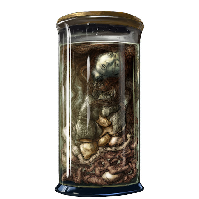
A penanggalan in a specimen jar. Part of an illustration for Evil Hat's Fate of Cthulhu rpg.


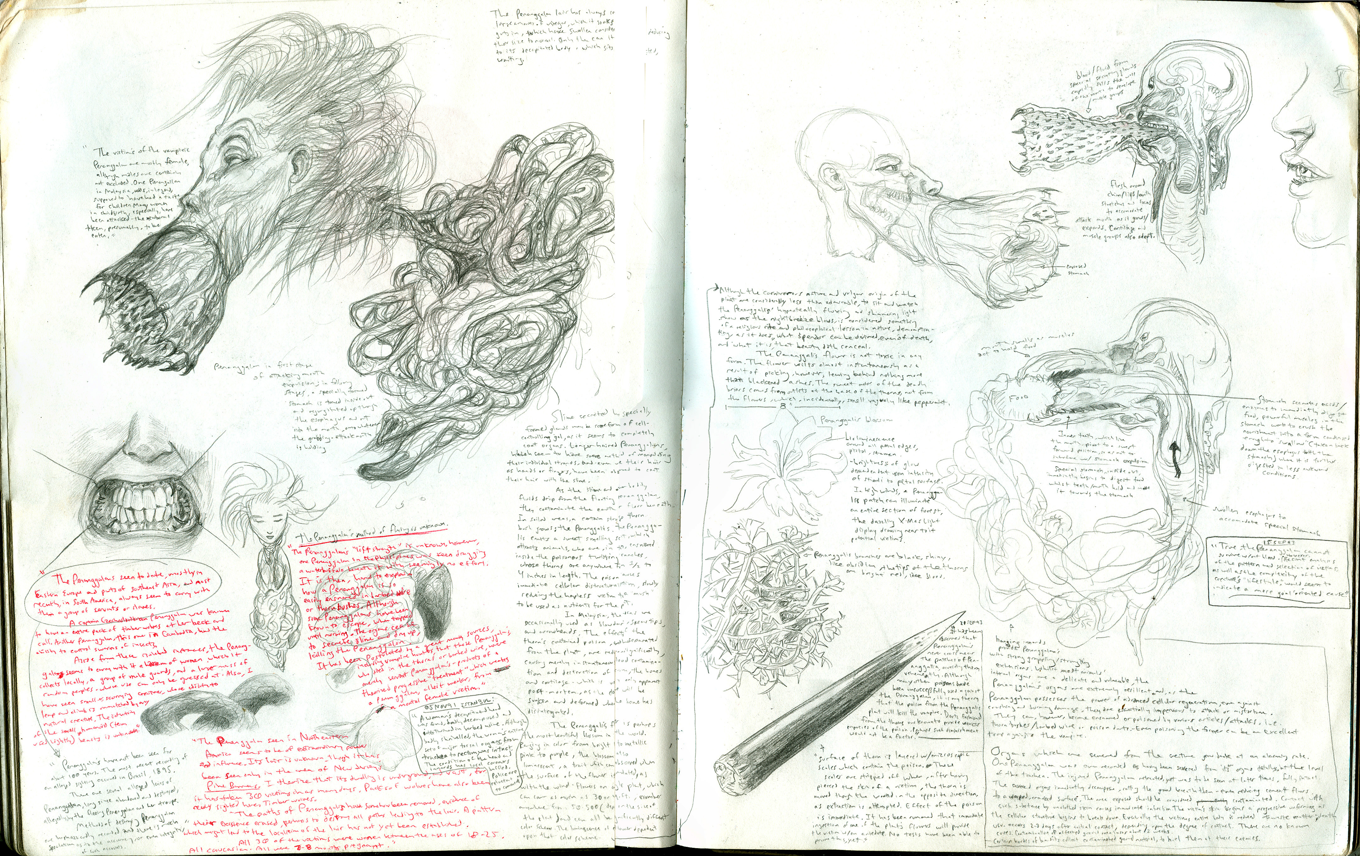
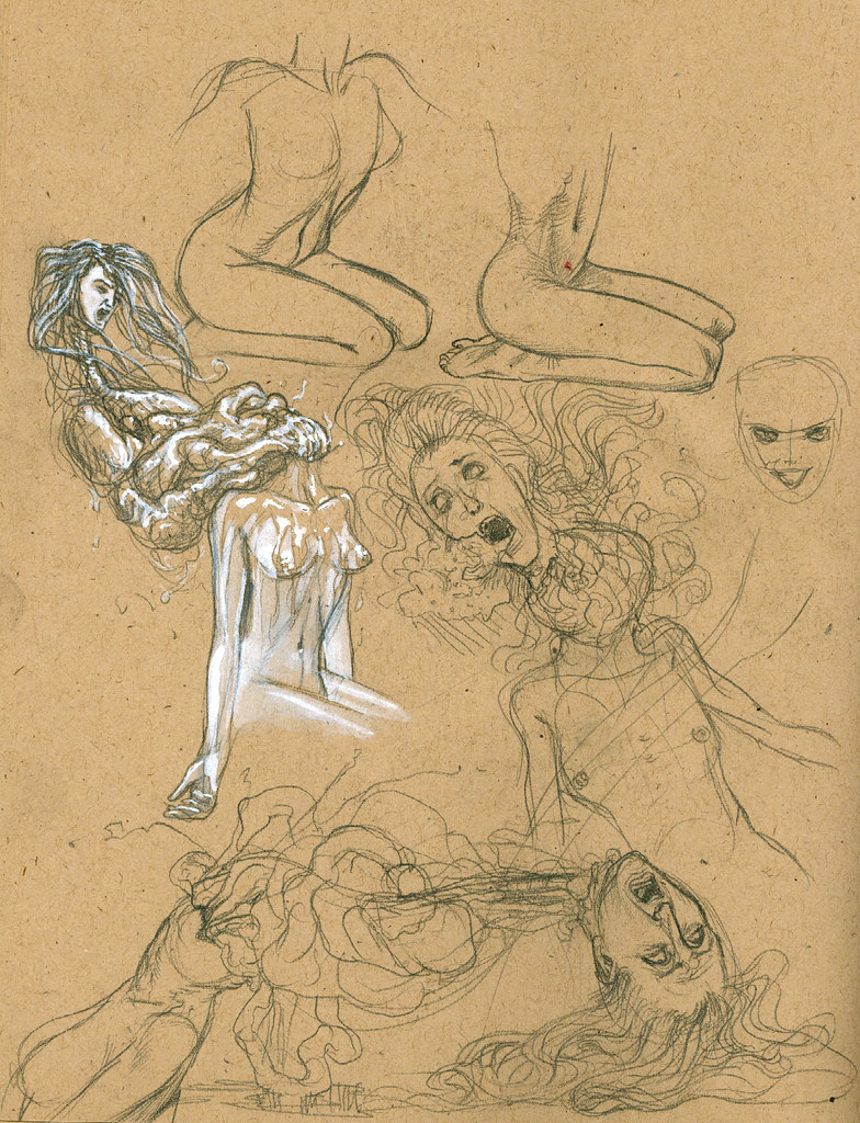
   According to legend, the Penanggalan was created thusly : a woman, while seated in a large wooden vat, used for holding vinegar distilled from the sap of the thatch palm (menyadap nipah) performing a religious penance (dudok bertrapa), is interupted by a man who asks what she is doing. She is so utterly startled that she jumps up, her head literally popping off of her body. The severed head, along with the entrails, which follow it through the neck opening, flies up into a nearby tree, shreiking. Ever since then, she existed as the Penanggalan, an evil spirit that has a certain weakness for newborn blood. You could protect your house by surrounding it with a thistle called Jeruju, which could ensnare the Penanggalan, trapping her until the morning when she was more vulnerable. It's not a very good story. It could use some elaboration. Ohhh, I did I ever elaborate on this. Examine these two pages from a 1994 sketchbook:


Kurt Komoda's notes on the penanggalan
My notes on the penanggalan from a 1993 sketchbook.
  
 In Malaysian folklore, the Penanggalan, hungry for the flesh of young children and babies, would separate from her body and fly over to her victim's house, go under it, and then come up through the floor to eat the child. Upon returning to her hidden torso, she would need to soak her swollen innards in a vat of vinegar (likely the same vat described in the origin story) to shrink them down enough to fit back into the neck hole and abdomen. I always wondered just how much of her insides she would actually take along with her. Obviously, lungs, heart, stomach, liver, kidneys, intestines- you know, the big ones. But what about her circulatory system? What about parts that lead to outside orifices, like the anus and vagina? In my drawings, I included those, but omitted most of the circulatory system- including only those embedded into the organs. I never went into enough detail to figure out at what point the arteries from the heart just simply cut off. If we are to accept the concept of a floating head and entrails, then I think it's okay to dispense with most other biological necessities. 

A penanggalan is born, by Kurt Komoda
  
  I my story, which was somehow going to be interwoven into my Agony a Go-Go story, the Penanggalan live in a hidden lair, protected by servants of the Mother Penanggalan, both human and otherwise. In my version, it is Penanggalan's own glowing slime secretion upon the earth that creates the special thorny plant that can ensnare her entrails and hair. Since this plant would grow in abundance around the lair, there are special servants which must constantly destroy it.
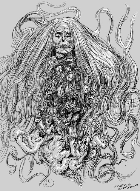
Mother Penanggalan, by Kurt Komoda
Mother Penanggalan
 
  So, above is the Mother Penanggalan. I forgot to scan in any of my old sketches, so I quickly drew this in Photoshop. I guess it's a tad bit ridiculous, but my original thought was that the Mother was the original Penanggalan, from Malaysia. Her body has long since been discarded and her Penanggalan form has grown and mutated. She has incorporated lesser Penanggalan into her form. At one point, I even had the snarling heads of tigers and wolves floating and snapping about, connected to the bottom of the Mother. Another idea was that she had no more working organs of her own, and used her "guests" life systems to support her own.

Penanggalan with flowing hair, by Kurt Komoda

  I imagine that the Penanggalan's hair is very much alive with motion, as if under turbulent water. The patterns and whorls created by the strands and locks would reflect the Penanggalan's emotional state. When she is calm, the hair would drift about like veils. As she becomes more agitated, the hair would coil and knot.

Penanggalan extending mouth proboscis, by Kurt Komoda
Penanggalan extending her mouth proboscis.
 
  The mouth proboscis was something my brother, Paul Komoda, came up with. I don't know if he ever drew it, but he talked about it. It was inspired by the bloodworms we used to use for bait, whose black fanged mouths shot out of them with ferocious speed, like the guts of something soft being crushed.


A penanggalan pushes her way up through the floorboards, by Kurt Komoda
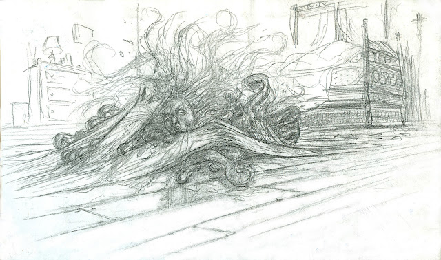
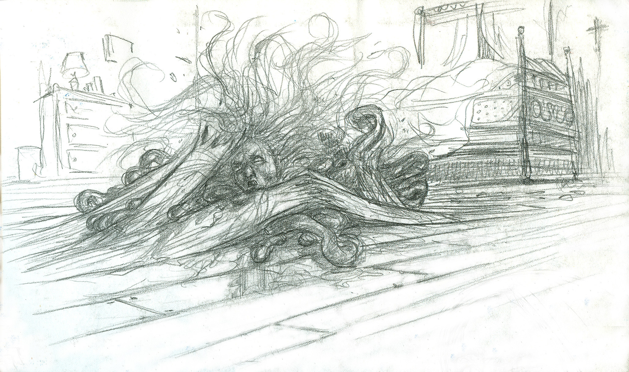
A penanggalan pushing her way up through the floorboards.
 
  According to folklore, the Penanggalan would attack her sleeping child victims by going under the house and coming up through the floor. The above sketch doesn't show a South East Asian abode, but does depict the power of the Penanggalan.

Penanggalan with flame-like hair, by Kurt Komoda
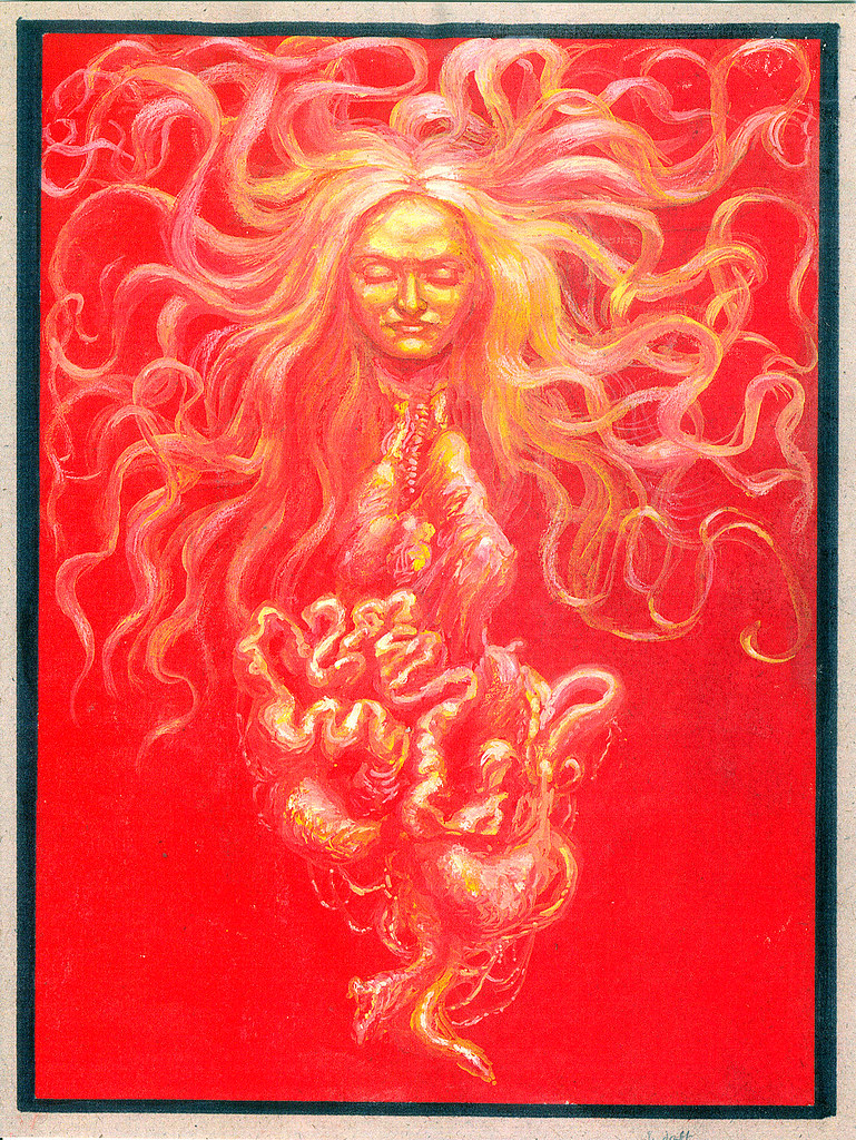
Penanggalan with flame like hair.
 
  Concerning the sketch above, I don't know what the thing at the top is. I was just doodling. Here, the Penanggalan has uncharacteristic flame-like hair.

Old penanggalan drawn with a mouse for Agony a Go-Go, by Kurt Komoda
  
 Above is Penina- one of the Agony Goddesses from Agony a Go-Go, drawn with a mouse, in Photoshop. There was a time when I drew everything with nothing but a mouse. I got fairly decent at it, but as soon as I bought a drawing tablet, I was spoiled and could no longer draw with the mouse. Once I bought a Wacom flatscreen tablet, I was spoiled again, and could no longer draw on the drawing tablet. 

Sketch for a newer version of Penina that was never used.

   Well, this was just a sampling of the many drawings of the Penanggalan I have done. Maybe someday I'll actually produce a finished piece of the subject.

Follow me on Instagram! Kurt Komoda's Instagram


Wednesday, March 31, 2010

Rooms Through Windows


   Let's get all this started. So, I've had this blog space for months and months, now, and I've gotten disgusted with myself for not using it. My website (Agony a Go-Go) has been, with the exception of some tutorials I've written, stagnant for much longer than I think any fans of the site were willing to stay on the hook for. So, it comes to this blog; and easy way, I would think, to commit my thoughts to the web for anyone, or everyone, or no one, without the hassle of tending to the overwhelming overhaul of an outdated website.

   I thought I'd start this off by confessing that I have this strange passion for windows. Rather, looking into windows. Wait! Stay with me, here. Rather, looking at the rooms that can be seen through windows- but not up close. Nay, that would be spoiling it. If I can be up close to the glass and see right into the room inside, ignoring the window, why even have the window? It is essential that the window be somewhat distant, perhaps across a street, and the view to the inside be somewhat obscured, both by light and object. Most often, the window is above me, not at eye level.

   Rooms within rooms, that is, rooms that can be seen through an archway or down a hall from the room to which the viewing window is attached, are especially intriguing. Stairs leading to other spaces. Those are nice, too. Curious lamps. Colored lighting. The current room dark but with light emanating from a room far on the opposite wall or around a corner, hidden. These add to the effect.

   A voyeur, you say? Not really. I don't want to see people in the rooms. The spaces must be unoccupied. There is a mystery and a serenity to the still room. A place that I can only see in passing. A place I will never set foot in. It's like seeing a little bit of some other life. Someone had to put this room together, had to decide to place just that statue by the window. People use this room or these stairs or this hallway day to day.

   As far as looking through windows, it's not something I stand there and do. It's just something I see in passing, and then I hold the image in my head as I walk or drive along. In the photo below, which is a building on the corner of 19th Street and 6th Avenue, in New York, I love the massive staircase and how you can see another flight just beyond it. I don't normally photograph the windows, but needed some photos for this article.


   It's just something that I somewhat fancy. It's not like I obsess over looking at windows. I certainly don't go out of my way to do it. I just adore these little glimpses into that other world.