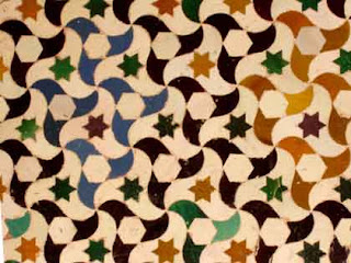
Tessellations. It's what M.C. Escher referred to as "Regular Division of the Plane." Basically, it is filling a surface with the same exact shape or shapes. At it's simplest, a checkerboard is a tessellation. The earliest of complex tessellations can be found in the Alhambra. Unfortunately, the Moors, who built the palace, were forbidden to depict living things in their works of art. Today, tessellation is mostly relegated to mathematicians and crystallographers. Escher took it further than anyone before or after. His creative mind, eye and hand were like no other, and I have always been in awe of his work.
 |
| Alhambra tiles |
In 1995, a man named Kevin D. Lee, of Sandpiper Software, created a program called "Tesselmania" that allowed even children or people who like Wolfsheim to create their own tessellations. As the story goes, Tesselmania was a product of "The Learning Company" and was later bought by a toy company and effectively buried forever. I have never been able to find a fully functional copy, although I have it for both Mac and PC. It's an extremely limited program. It runs in 256 color mode, has only one undo level, and draws like the earliest paint programs(no blending or mixing). The tessellations, themselves, can only be comprised of straight lines between a limited number of points. The PC demo version lacks a save function- so you'd have to take screen grabs and paste them into Photoshop or something. The Mac demo version only stays on for 30 minutes at a time. I've provided links for both versions below.
Nevertheless, it is an extremely useful program. I wish someone would update it. It would be perfect for Illustrator. I've seen other programs, including an Illustrator plug-in, but none are as useful as Tesselmania. In the division of the plane, there are 3 main principles at work: glide reflection, translation, and axles(or rotation). A system of labelling the 28 known types of asymmetric tiling- using combinations of the 3 principles- was created by German mathematician, Heinrich Heesch, and is known as the Heesch Type. Tesselmania allows you to create using 15 of the 28 types. I won't drown you in the details of the types. Below are some of my efforts. You'll immediately notice the aforementioned primitive graphic style of the images.I would say that Tesselmania is only a starting point for identifying one's tiles. Further work could be done in another program to create a finished product, but I have so far found such an effort unnecessary. When creating these tiles, I have tried to adhere to the 3 rules laid out by M.C. Escher, concerning the shape of the tiles:
- Tiles must have a closed form. That is, the entire object must be represented. A tile cannot be part of something that trails off, but is not shown.
- The outline of the object must be as recognizable as possible. Simply making some wobbly shape and cramming the image of, say, a dog all rolled up into it doesn't count. I've seen this rule broken again and again. Another way of breaking this rule is the most common travesty performed by aspiring tessellators: the filling of empty space within the tile, or the creation of space-filling tiles around your tile- the purpose of which is to make the tiles "work." If we were to allow this, then any shape could be fit inside a tile of any shape or be surrounded with additional tiles until they make a combined shape that tessellates. I have done this in the image below. You see, I created this tile, but it didn't really work; I still had that little square space where the bottoms of the wings meet. So, I just left it there. Very lazy. Years ago, I patted myself on the back for this little creation. Today, I am disgusted by it.

Conjoined twins tile (a travesty).
- Finally, the outline must have no indentations and bulges that are too shallow or too deep. This is simply for the matter of distinguishing one tile from an adjacent tile. Long, spindly spikes, for example, and their complementary crevaces(for there must be equal-sized indentations for the tiles to fit together) become confusing to the eye.
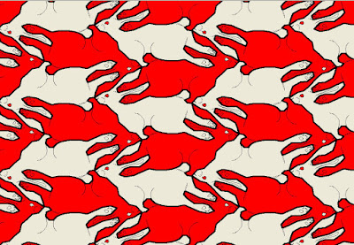
Anyway, here are my experiments. The colors in some are just horrible, so just try to ignore that, for now.
 |
| Buzzard Things. Was never crazy about this one. The line work of the feathers is extremely wobbly. |
 |
 |
| Lizard Guys. When drawing the borders for your tiles in Tesselmania, you can only use straight lines, and this is very apparent here. |
 |
| Curly-Tailed Lizards. I like the effect of one tile spiraling into the others, but it can be more visually confusing than appealing. |
 |
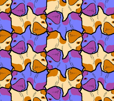
| Corgi Puppy. |
 |
| Little Nik. This is supposed to be one of my dogs- or I should say "former dogs"- Nikita, as a puppy. |
You guys should download the program and try it out for yourself. In Windows, you have to right click on it, and in properties, set it to open in 256-color mode. For the Mac download, I don't think you have to do anything but put the appropriate tesselmania folder on your desktop, or wherever. You might have to do something so it opens in OS9(Classic). Remember, though- you only have 30 minutes at a time with the Mac version, and no save function on both. Take screen shots(command+4, on the Mac...PrntScrn on the PC).
Have fun, and be sure and share your creations!
- Kurt Komoda
Follow me on Instagram: https://www.instagram.com/kurt_komoda/


