A long time ago, there was something called "MySpace." It might still be there, but my account has long since been deleted after realizing that Facebook was a much better way of keeping in touch with friends around the globe. One of the only things that kept me interested in MySpace was the whole "Top 8" concept- you know, those 8 friends that you selected that were better than all others(called the "Less Than 8" or <8). Every once in a while, I would come up with ways to customize my Top 8(called, at least on my page, The Mega Super 8 Strike Team) in artistic ways. It was a neat way to give myself something to do- which is something I need to do all the time, before I'm nothing but a commercial artist doing other people's work. My favorite Mega Super 8 Strike Team(MS8ST) project was when I decided I would draw each one in the style of one of my favorite comic book artists with each illustration done in the style of the artist's comic.
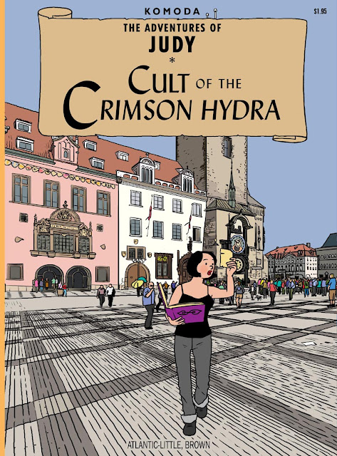
Right off the bat, I had trouble picking the 8 artists. I knew I wanted Moebius and Hergé, for sure. I had a bunch of other artists floating around in my mind, but then the trick was to match the style with the person, and what they'd be doing on the fake comic book cover. Some people's faces were a better natural match for the artist in question. First off was Judy, because I thought she'd look good as a Hergé character:
I grew up reading the full-sized Tintin comics and I knew I wanted to match the style as close as I could. I think I got the fonts spot on. I drew the background from a photo of a square in Prague, I think- but, I drew it without thinking about the cover as a whole. I did a bit of work on the clock tower, thinking it was such a nice composition before realizing that it would all be hidden behind the title scroll.
Though it looked right at the time, I think the black line work is a bit softer than the ink line that Hergé used.
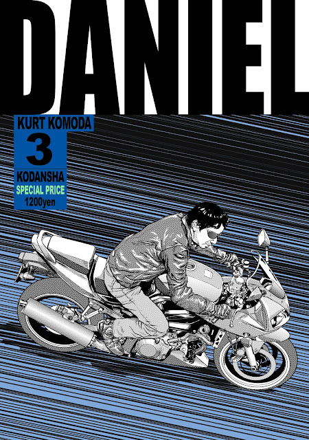
Next up was my friend, Daniel, done in the style of Katsuhiro Otomo and his original Japanese printings of Akira. Now, the thing is, Otomo's covers for the Akira books always used his painted illustrations, but that's not the style of Otomo that I wanted to try, so I cheated a bit:
I knew I really wanted to experiment with his incredible depictions of vehicles and mechanical devices, as well as his master use of zipatone. If there's one thing I hate drawing, and those who work with me know this: it's wheeled things. Especially bicycles or motorcycles. And when I say "hate," I'm only saying that because I can't do it well at all. It's the wheels- all those perfect ellipses- the fine work on the frame, and the relation of the rider to the bike itself. To me, it's very challenging, even when I have exact reference, so I knew that this would be fun. Daniel is a sales manager at Soho Vespa, in NYC, and he's an avid rider of both scooters and motorcycles, so I matching him with Otomo was a no-brainer.
To complete the drawing, I created a whole folder of fake zipatone(which I called zipaClone), with a wide variety of tones and gradients. I applied them pretty much the way real zipatone is applied, but did it digitally: I cut out a selection of zipaClone and placed it over the area, applied a hide-all mask, and then just brushed it in with the paintbrush tool. I think it worked out pretty well.
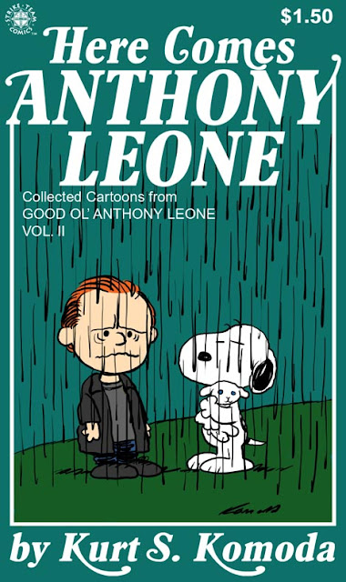
Anthony was next, and he's a lover of the old Peanuts strip and cartoons, so I didn't have to think very hard to come up with this one. He also has this round face and a high forehead, so he translates well into the style of Charles M. Schultz.
Even before I started looking up reference, I knew there would be a problem: Peanuts was never really a comic book with a regular format and a recognizable cover style, so I had to cheat again. There was a series of Peanuts books that had this exact format. Well, almost exact- I couldn't find the font they used, so I had to modify an existing one. Originally, I was going to have all the characters on the cover be original- either mine or my brother, Paul's- so that Snoopy would have been some character of ours, or maybe another person I know. It just wouldn't have worked. It HAS to be Snoopy to really sell it.
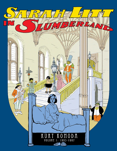
I absolutely had to try and do one in homage to the master, Winsor McCay and his Little Nemo in Slumberland strip. My friend, Sarah, has a face that works well with McCay's clean style.
Now, be warned, the linked image is a HUGE file, but I wanted to, well, show off the work I did to replicate the style of color printing from the old strips. I laid in each color separately and then applied a Half-Tone filter in Photoshop, but then purposely offset the orange-red color up and to the right by several pixels to simulate an often inconsistent printing process. Again, I ran into the same problem I had with the Peanuts project: Little Nemo didn't come in comic book form. The style I chose was from a McCay collection book that had a nice cover layout. This project also gave me the chance to put a number of other friends in supporting roles.
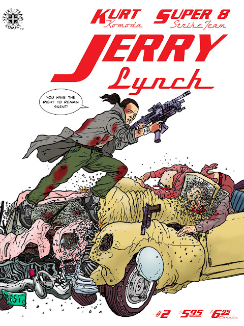
I was going to do my friend, Jerry, in the style of Moebius(Jean Giraud), but eventually went with Geof Darrow and his Hard Boiled comic.
I figured, from the start, that there would be a car crash. Or a plane crash. Or a huge locomotive crash. Some sort of crash. Something sure as hell would have to be crashing into something else, and there would be a lot of flying glass pebbles and crinkled metal and human bodies all crushed up in there. The guns I drew are actually a lot more streamlined and based on real models than what Darrow probably would have drawn. I remember having a real problem trying to come up with an appropriately pulpy line of dialogue for Jerry to say as he lept between to colliding vehicles. One was "This is a school zone: the school of PAIN!" I'm not crazy about the line I chose, but it functions for what it is, I suppose. I think I should have made the vehicles bigger, or Jerry smaller.
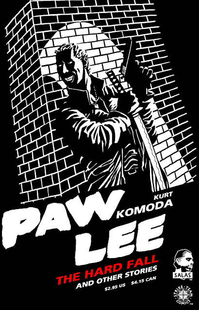
Frank Miller was not an artist I had originally thought would be in my top comic book artists list, but then I was looking through a Miller comic my friend had and was reminded of just how clever he was with the play of white and black.
I showed no such mastery in my rendition. I think I made a lot of choices that Frank Miller would never have made. The whole process of creating this one was kind of painful- a lot in part, I think, due to the fact that I was relatively new to Miller's style. I kept considering changing to another, more familiar style, but Paul had seen the sketches I had done and was excited to see the finished "Sin City" result. Paul has this huge, Judge Death-like grimace, and I knew I really wanted to play that up in the Miller drawing- maybe just showing the huge teeth and eyes over an immense shadow, but I just couldn't get it to look right.
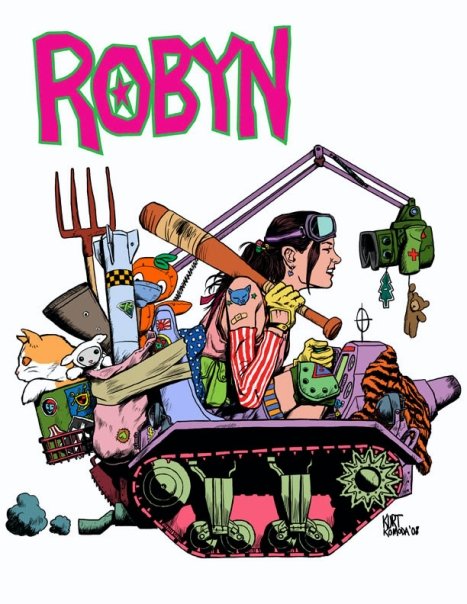
The Robyn "Jamie Hewlett/Tank Girl" cover was the last one I did, because she was pretty late in coming to my Top 8. I was going to use my friend Ken, who is Japanese and has this great Hewlett-like mop of hair with a bang that covers one eye, but I went with Robyn, instead. I was hoping to use Ken in a rendition of Shigeru Mizuki's "Graveyard Kitaro," but that never got done.
Robyn doesn't really have a face suitable for Hewlett's style, but I knew I wanted to do a Hewlett cover. My friend, Sabrina, would have been perfect for this. She doesn't look like Tank Girl, but she does look like she could be a Hewlett character. I'm not crazy about the fact that I so closely followed an existing cover, with the super-deformed tank and all, but I am relatively satisfied with the end result.
So, that's as far as I got, and I never got to do a Moebius cover. Because My Top 8 had one or two slots that kept changing, I had 3 more covers planned- I may still do them. Someday.


I think the Tank Girl one looks quite a bit like Jaime Hernandez.
ReplyDeleteAwesome!
ReplyDelete